The editorial design of Histórias que Falam is guided by clarity, restraint, and formal coherence — a visual response to a collection of poems and reflections rooted in the traditions, landscapes, and identity of Madeira.
The cover introduces the tone of the book through a serene image of the Ponte dos Cinco Arcos, placing the reader immediately in the geography of memory. Its symmetry and quiet presence reflect the themes within: heritage, devotion, and belonging.
Inside, the design favours a rigorous formal structure. All text is left-aligned, never justified, enhancing readability and echoing the natural rhythm of the verses. Margins are generous and consistent, giving space for the content to breathe. Each poem is introduced on a new page, reinforcing its autonomy while maintaining continuity.
The typographic treatment avoids stylistic distractions. A single serif font is used throughout, with subtle variations in weight and size to distinguish titles, attributions, and body text. There are no ornamental elements; the design lets the text speak, uninterrupted.
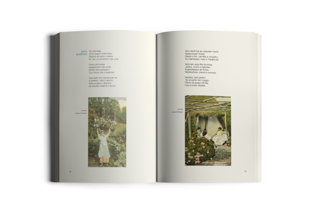
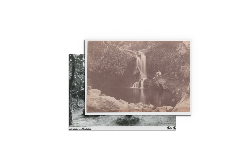
Photographs are inserted with care and relevance, always aligned to the grid and balanced with the text. They serve as visual footnotes, contextualising the content rather than overpowering it.
This project embraces editorial discipline, offering a layout that is respectful of the written word and the reader’s experience. It is a book designed to accompany the passage of time — with the same quiet endurance as the stories it tells.